Have you ever clicked on some advertising (whether it’s on Google, Facebook, YouTube, wherever) only to click back in your browser shortly after?
You probably did it without any thought really… a natural reaction, in a way, to the website.
Perhaps it:
- Loaded too slow
- Didn’t lost properly (it looked broken)
- Wasn’t immediately relevant (or totally irrelevant) to the ad you clicked
- Didn’t look appealing
- Wasn’t clear what you should do next
Our internal “filter” for this sort of browsing behaviour is something almost practiced instinctually now, through years of having to sort through the immense amount of information available in order to find what’s relevant or important to us.
Especially in search, we’re on a mission to find something. This is the beauty of Search Engine Marketing (SEM), we know the users are actively on the hunt and we have the opportunity to put something in front of them.
And yet, why does our advertising traffic bounce? Why doesn’t the traffic spend more time looking at our site, or traversing our pages of information?
The answer is because of our now-instinctive behaviour to filter out irrelevant information. And that’s not to say that your information is not relevant, just that it’s perceived to be (for many reasons).
There is one really simple, rather cheap, incredibly effective, and depressingly underused tactic that you can employ in order to reduce your advertising bounce rates, engagement, and conversions…
Give them what they want…a relevant landing page!
A landing page is simply defined as the page you send the visitor to when they click your ad. Some advertisers do this terribly by just sending the traffic to their home page, some people do it OK by sending traffic to a product/service page, some people do it the best way by sending traffic to a page specifically created for that ad.
Using a landing page allows you to send targeted traffic from your advertising to a similarly targeted page on your website, which then allows you to:
- Have a consistent message from pre-click (your ad creative) through to post-click (your landing page)
- Improve the relevancy of your content to what the visitor is looking for
- Be specific in your offer and your message, and specificity sells
- Opportunity for post-click optimisation, testing alternative messages/designs against one another to improve conversion rate
- Gather analytical data about how specific advertising campaigns are working, rather than looking at the sum of all campaigns
There’s a wealth of undeniable proof that the use of a quality landing page can provide a massive boost in conversion rate. So much so that the field of post-click optimisation (A/B split testing, etc) has become a speciality of its own.
Let’s take a quick look at a hypothetical…
While the upfront costs of using landing pages and engaging in conversion optimisation is higher, you can see that even small increases in conversion rates can mean lower Cost Per Conversion. Lower costs means higher ROI.
Now that you’re convinced that using a landing page is going to be the best possible thing for your advertising ROI, what type of landing page should you use?
Standalone Landing Page (no navigation)
In a traditional sense, this is the true definition of a landing page. There is only the message and the call to action, no navigation, no blog, no distractions, no alternative exit paths.
This is the ultimate in utilising an on-target message and call to action as part of your advertising.
The important part of this concept is that there are no alternative exit paths other than your call to action, so visitors aren’t going to get distracted by your blog, or links to Facebook, etc. With no distractions your visitors are forced to focus on your message and call to action, and either convert or leave.
Pros: highly on-target message, no distractions or exit paths, clear call to action, tightly defined sales funnel, very testable, flexible design
Cons: analytics data harder to collect (bounce rate, time on site, etc), advertising targeting must be spot-on, easily ineffective if done badly, more costly upfront to setup
Hidden Page on Website (with navigation)
A cheaper and easier option is to setup a hidden page on your website, one that still uses your websites header and footer but has a clean and simple body to it.
While you can still have a very specific and on-target message in the body of the page, the visitor is given the option to click about your website via your navigation. Doing so might confuse them as they can’t find a link back to your landing page (hidden page) without using the ‘back’ button.
In some instances giving the visitor access to secondary content like your About page, or your Blog, is useful for building trust and authority. However it can be a double edged sword, if your core company website is broad (i.e. you have many services) and the secondary content isn’t on-target with the visitors wants/needs.
It comes down to working out what’s best for you, given your sales funnel and primary objective with the advertising campaign.
Pros: cheaper and easier to setup, secondary content can aid conversions, easier to get analytical data (i.e. if they’re using the site or not)
Cons: visitor has distractions and exit paths, harder to put focus on your call to action, inflexible design
Standalone mini-site
Building a completely separate mini-site for your campaign is the best of the best, but can be overkill.
It’s a common tactic amongst big brand names who do creative advertising campaigns, to create a mini-site around that to complete the user experience and get more from the campaign. That said, it’s a tactic smaller business can utilise as well.
If you have a product/service that is a complex sale, or you want to create a deeper user experience, then this is the path you take. Perhaps you’re a company who sells a few different big-ticket items, and you decide to really push one of those products – having a mini-site dedicated to the features and benefits of that one product would help with your conversion rate.
Pros: the ultimate in being able to provide an on-target and specific message, a lot of ability to gather meaningful data, very targeted traffic means split testing opportunities
Cons: most costly to make, takes a lot more time to plan and build
How to choose the right solution for your campaign
There really isn’t any right or wrong answer to this – it comes down to your strategic approach and individual campaign goals.
If you don’t have a big budget, then your best step forward is to create a page on your website that’s dedicated specifically to your campaign. It’s low cost and fast to do, and if your website is using a CMS you can probably do it yourself.
Once you’ve setup your campaign and you’re starting to see the ROI from it, you’ll probably want to start optimising the performance – this is when you might step up to a more serious solution like a dedicated landing page or a mini-site.
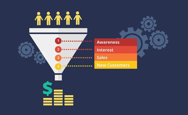
It also comes down to what your sales funnel is within the campaign…Pushing for a direct sale on a big-ticket item is very different from asking them to opt-in for a whitepaper. Break your funnel up into actionable steps and measure each point to see what is and isn’t working.
This is why it’s worthwhile spending the time upfront to strategically plan your marketing and individual campaigns, to ensure you’re giving it the best chance to succeed and payback to your business. There’s too many people who have been scared off of advertising because they didn’t approach it smartly.
Do you think your advertising might be bleeding money? Try our online marketing audit and get specific feedback on improving your ROI.
